
Color Theory: Accessible Complementary Colors

Maybe it's the software engineer in me, but I love solving complex problems in lazy ways. If there is a way that I can script it, program it, or otherwise automate - I will find it.
In my last post, I shared how you can use Google Chrome's Color Picker to Improve Text Color Contrast. This post was largely influenced by the work I've done on my personal site to create dynamic color schemes from a selection of key colors.
Here is an example:
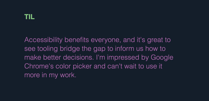
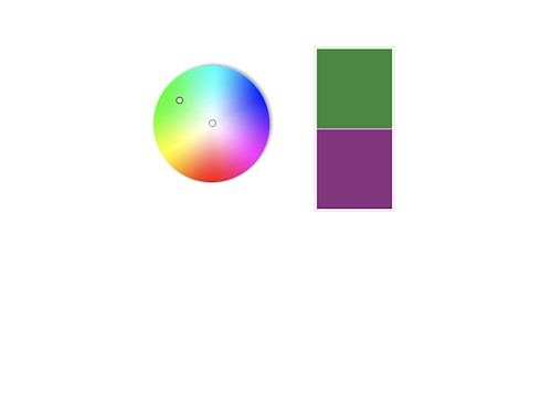
This example shows two colors: green and purple. These colors are complementary to each other, and it shows. Look at how stunning they are together.
But I didn't choose that purple color.I did choose that green color. Using color theory, the purple color is generated as an RGB complementary color. A complementary color is generally found opposite on the color wheel:
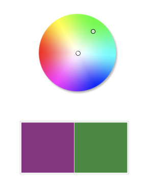
Complementary colors feel vibrant and can make things on the page pop. Luckily, there are a few tools out there that already exist, and can help us to do that.
The invert-color package can take an input color and generate a complementary color. Let's give it a whirl. Using your favorite package manager, install this package and grab your favorite color.
import invertColor from 'invert-color';

const color = "#04c9db"; // (cyan)
const complementaryColor = invertColor(color);

// complementaryColor = #fb3624 (red)And just like that, we have our complementary color. We can use this color in subheadings, quotes, or wherever it fits. But what if we need it to render in both dark and light modes? What about the generated color contrast?
We want our complimentary color to pop. More importantly, we want it to be legible. In some cases, the complementary color needs some adjustment for it to be accessible by a wider range of audiences. If we look at our color without any adjustment, it looks like this:
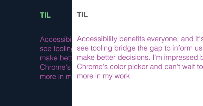
This is a good start. However, when checking the text color contrast, it deserves more contrast to become more accessible. Could we software engineer this problem?
You betcha.The YIQ color space is useful here because unlike RGB, it produces better results for calculating color contrast. For our use case, we're going to calculate the luminance value of our complementary color, and then adjust to 128 (halfway between black and white).
To improve the hex color contrast, we will:
- Convert our color to RGB.
- Determine the luminance value.
- Calculate the percent change from the luminance value to 128 (50%).
- Adjust the color brightness of the original color, using the percent change.
These problems have been solved before, so rather than try to solve it myself, let's use the fine work from open source.
To convert your hex color to RGB, you can use the hex-rgb package. Convert the r/g/b values to the luminance value (YIQ) using the getContrastYIQ function. Once you've done that, we will calculate the percent change and then change the color's brightness using this function to lighten/darken hex colors.
Here's how you do that:
// Invert the initial color
const complimentaryColor = invertColor(color);

// Convert the hex code to RGB
const { r, g, b } = hexToRgb(complimentaryColor);

// Determine the luminance value of the R/G/B color
const yiq = rgbToYIQ({ r, g, b });

// Detect if using dark mode
const match = window.matchMedia('(prefers-color-scheme: dark)');

// Mid-way between black (#000) and white (#fff)
// You can change this for dark mode or light mode too.
const threshold = 128;

// Calculate the brightness percent change with color scheme in mind.
// -> Lighter for dark color scheme
// -> Darker for light color scheme
const brightnessChange =
    match.matches
      ? Math.max(yiq, threshold) - Math.min(yiq, threshold)
: Math.min(yiq, threshold) - Math.max(yiq, threshold);After making these changes, the complimentary will now have improved contrast. Here's an example where it made an improvement from Level AA to Level AAA:

You can hardly tell the difference, so let's view the same change in dark mode:

With this small change, our text meets Level AAA requirements to have accessible text color contrast. And all without making any sacrifices to the design.
How awesome is that?


