
Improve Text Contrast with Chrome's Color Picker

Text color contrast is how we see words on a webpage against the background. In other words, it's how we make words the words pop off the screen. This article some of the information I learned while trying to optimize text accessibility on my website.
Good contrast is important for everyone. For some, it's necessary.The following figures for guidance on how to best provide good contrast for users with visual disabilities and other accessibility (a11y) needs. These figures are provided by the Web Content Accessibility Guidelines (WCAG) website.
The Web Content Accessibility Guidelines uses A/AA/AAA leveling to describe their requirements for ADA Compliance. The success criteria for these levels will vary for each accessibility feature.
Level A is the minimum level.
Level AA is the next level and will have additional requirements to satisfy circumstances that present beyond Level A.
Level AAA is the maximum criteria that will have more challenging requirements in order to satisfy a wider range of circumstances.
When it comes to design, if we can meet Level AAA, that should be the goal - in order to make the interface more accessible to a wider range of users.In the following examples below, we are using Google Chrome's color picker in the developer tools. The color picker will present guides to help choose a color that is more accessible.
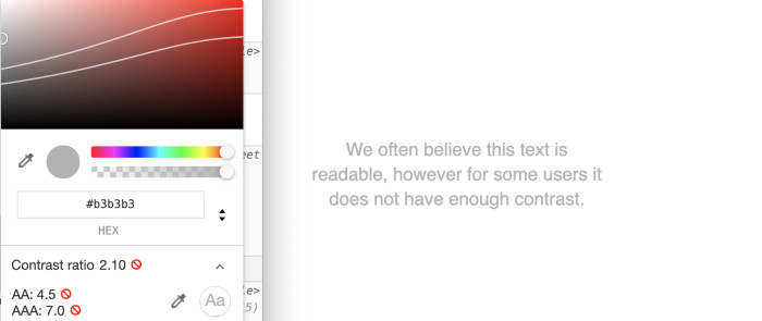
Level A does not have requirements for text color contrast. White text on a white background will have a radio of 1:1. Here is some typical light grey text that has a contrast ratio of 2.10, for comparison:

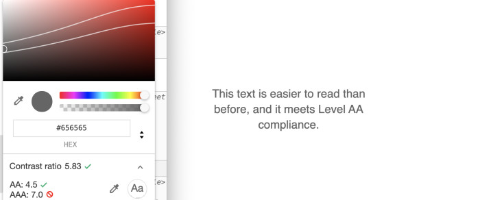
The WCAG provides a Level AA requirement of 4.5:1 contrast ratio for normal text and 3:1 for large text. This makes the text easier to read for most users. However, because of the font size, some users will still have difficulty reading this text.

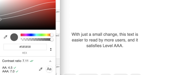
The WCAG provides a Level AAA requirement of a 7:1 contrast ratio for normal text and 4.5:1 for large text. This makes the text easier to read for most users. However, because of the font size, some users will still have difficulty reading this text.

That's better. And thanks to Google Chrome's dev tools, it's easy to identify when text color needs improvement. Using the color picker, we can detect the color contrast and use the guides to choose a better color.


