

Render Less React @ React Boston 2018

One technique for dealing with massive layouts is called virtualized rendering. Virtualized rendering reduces the size of the DOM tree and the impact on layout thrashing.
This presentation will give you a high-level overview of virtualized rendering, and how to render massive layouts with performance in mind. You can watch the video above, or read the following transcript.
Hello everyone, my name is Cole Turner. And today, I'm going to be presenting Renderless - Creating Performant Layouts.
A bit about myself, I'm a UI Engineer in Acquisition at Netflix. That means I get to work on the awesome signup flows and the landing pages that hopefully get you to sign up for an account and become a member.
Before that, I was at PayPal, where I worked in Checkout and just been in startups for a little bit over a decade. Why that matters: when you're in the business of finance and streaming, you want to make sure that you're meeting all of your customers’ needs. Whether they're a 4G user in the United States or a 2G user in India - we all don't have the same souped-up iPhones and connections that we do here in the US.
What I love about working at Netflix is we have a dogs-at-work policy. You can bring your dog to work. And I love that. Mine's in the middle, by the way.
For me, it's super awesome, and makes my paw-ductivity go through the woof.
I wanted to create this dog application because I love dogs. I want to sit and scroll through it all day. You know, I like fluffy dogs, dogs with floppy ears, pointy ears, even ones with funny glasses. I built this application, and it uses what's called a masonry layout. It's great because you can load elements of different sizes, and they fit well together. It uses infinite scroll so that you can just keep going through the website to see more dogs. It was awesome, and I pushed it to production.

The trouble with infinite scroll is after about two or three pages; the browser couldn't accommodate any more DOM elements, or things held in memory. The users’ browsers were crashing because they were using low-end Android devices and Chromebooks and things that weren't optimized to load 10,000 DOM elements. And what I learned through that is that not everybody has a souped-up MacBook Pro with 64 gigabytes of RAM like I do.
And that's bad. Because if you're, if your website crashes, it's pretty much game over. Your users will find a better experience elsewhere. That's why I'm here today. Because I want to say that react developers, we worry too much about avoiding re-renders. We're constantly optimizing for shouldComponentUpdate and "why did you update". But I think, rather than worrying so much about state changes; we need to worry a little bit more about how much we're rendering.
How much are we sending to our users? How much are they actually using? And what can their browser accommodate? What is accessible? If you're sending more to the user than they need, and they never get to that, what's the point? And if it crashes their browser, it's game over.
I put together this game called Rendering Jeopardy. And the topic today is things that make your layout slow. So I'm going to need your involvement and your help with this.
Can anybody tell me for $50?By the way, there's no cash.For $50, what makes your layout slow?
DOM mutations!
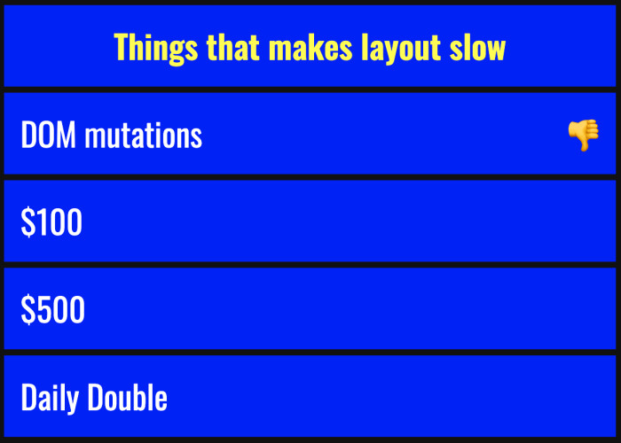
DOM mutations are super expensive in react because when you render a lot of changes, it has to diff with the virtual DOM, which means it's calculating all these properties that have changed. It needs to synchronize that back to the browser so that it can flush the actual changes. And when it synchronizes the new DOM tree, it's inserting and pulling out nodes that have changed. So like, if you change a tag or it crashes, then it will completely replace the element with the new one.
All right, for $100, what makes your layout slow?Animation? Pretty close.
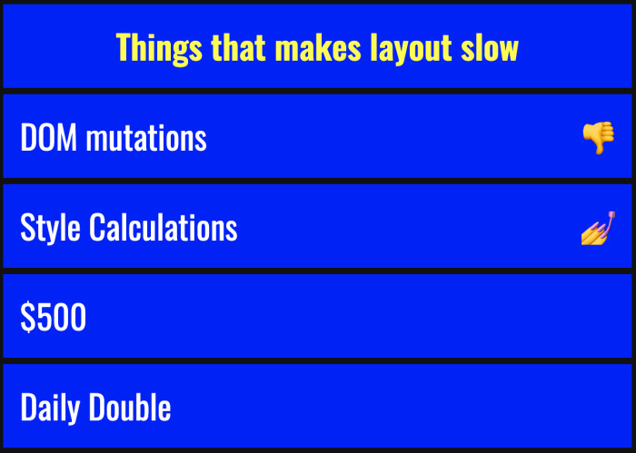
We're looking for style calculations, which is kind of similar because animations come with style calculations. It's expensive because the browser has to calculate the box model.
Earlier, we heard a talk about getBoundingClientRect, which is a super neat API for detecting how large an element is. When the browser does that, it's painting the element. It's positioning it to figure out where it belongs on the page. Here's where a lot of layout lag is observed by your users. When the browser does a style calculation, its painting and some layouts can be a little bit slower than others.
There's an excellent article where it says CSS floats can be 14 milliseconds to paint, whereas Flexbox is only three milliseconds. That could be potential performance savings.
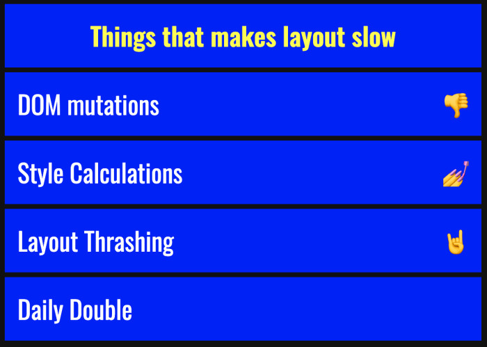
The next one is layout thrashing. Layout thrashing is when it does all of these operations. It's diffing the DOM, calculating the style, and applying these mutations all at once. On a massive scale, it’s applying all of these mutations. Imagine 100 elements repainting at the same time.
All right now for our Daily Double. Can anybody tell me what makes your layout slow? Shout it out.Too much stuff!Rendering all the things!
Yes. All right, thank you. Whoo, I did not plant that.
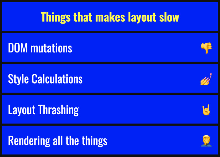
Rendering all the things is kind of slow because when you render everything, it has to do all of these DOM mutations, it has to do all the style calculations, and it's thrashing everything at once. I call this "Rendering Jeopardy" not just because it's a game, but it also jeopardizes the performance of your app and the success of it moving forward. When you're in the business of streaming, finance, or even putting blog posts up, you want your users to have that accessibility and not to crash.
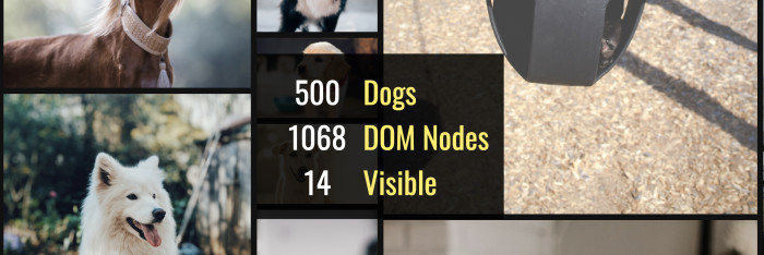
Going back to my application, I looked deep down into how it was performing. And I found that for 500 dogs, we were rendering two DOM nodes per dog. And so we were rendering over 1000 DOM nodes. And among those 500 dogs at any given time, only about 11 words are 24 were visible. When you're only showing a subset of your layout, why show things that they might never see why render it? Why incur the network cost of it?
That's why I'm here today to talk about rendering less.
What that means is: create less elements, render the viewport only, only the things that the user sees at any given time. Don't bother with the stuff that they're never going to reach. You can get a performance gain by getting rid of the elements that they've already seen.
Why the viewport matters most is, as the viewport changes location on the page, that is what the user is seeing. You can gain that performance by rendering only that, so imagine those 500 dogs, only rendering those 11 that appear.
Minimizing the style calculations because we're rendering less we're not thrashing the layout as much. We're not calculating those styles. So it's a little bit of a performance gain there too. And by doing all this, we avoid the browser from reflowing and painting. If you can imagine, 14 milliseconds every 15 times per second, that's a lot of time to save. And the perceivable lag will go down quickly.
Through a technique called virtualized rendering, we can render less. It's been mentioned a couple of times today, which is super awesome because I don't hear about it much on the job. You can use utilities like react-window and react-virtualized to do that.
Yesterday, there was a really great talk by Christina about Lighthouse. She mentioned this really cool API called IntersectionObserver. I just learned about that for the first time yesterday. It's so cool because you can render using that API, only the stuff that's about to come into the viewport. Pretty cool.
So here is what a viewport looks like with virtual rendering. As you can see, dogs are coming into the viewport. And as they do, they're rendered by the browser. As elements exit the viewport, my component is de-rendering them. It's flushing the virtual DOM, and they're no longer retained in the DOM. We do this with enough margin for scrolling so that it gives the browser enough time to paint those elements.
When we do that technique, we actually can render 2000 dogs with only 336 DOM nodes. That is a massive amount of performance gain. And even though there are 120 dogs visible, we're still having that same scale of two nodes per dog.

It's fast. It's beautiful. And it appears exactly as we designed it because we see the web as we designed it, we want our users to see that as well.
Now, I do have one more thing. And I know the question that's on everybody's mind today. "Cole, I know we can render twice as many dogs."
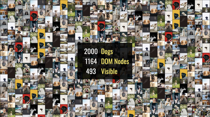
And you're right because we can render 500 dogs using 1000 DOM nodes, and you still have that same 2x scale. You're at the mercy of the browser at this point and taking full advantage of whatever resources are available.
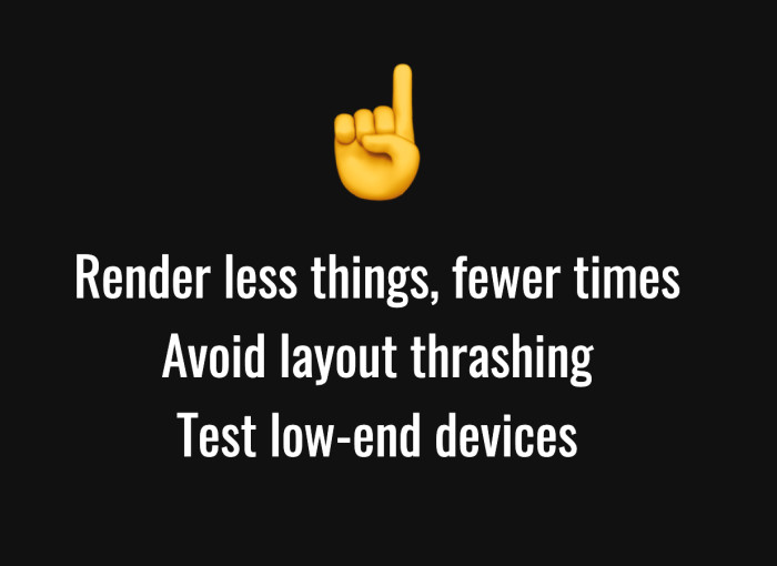
- Render less things fewer times
- Don't send everything to the browser that your user might not see. Give the browser precisely what they're viewing at any given time. Avoid layout thrashing. Keep an eye on like your browser developer tools or the profiler, which will tell you how many times thrashing the layout or calculating styles.
- Test on low-end devices. Don't wait for it to get to production. If you're looking for an excellent resource for this, check out browserstack.com. That will let you emulate your website on any device.
Thanks so much for listening (or reading along). If you're interested in more, I put together a couple of resources that can guide you further through this. Check out CSS triggers to see what animations or things you're doing that's causing your users to lag or crash. Google put together this great article about avoiding large, complex layouts - and layout thrashing.
Lastly, if you want to see more pictures of dogs, follow me on Twitter. (@coleturner).Thank you!


